Retune
Project type:
Brand Identity
Social Media Design
Email Design
Completed with:
Illustrator
Indesign
Photoshop
Role:
Graphic Designer
Overview:
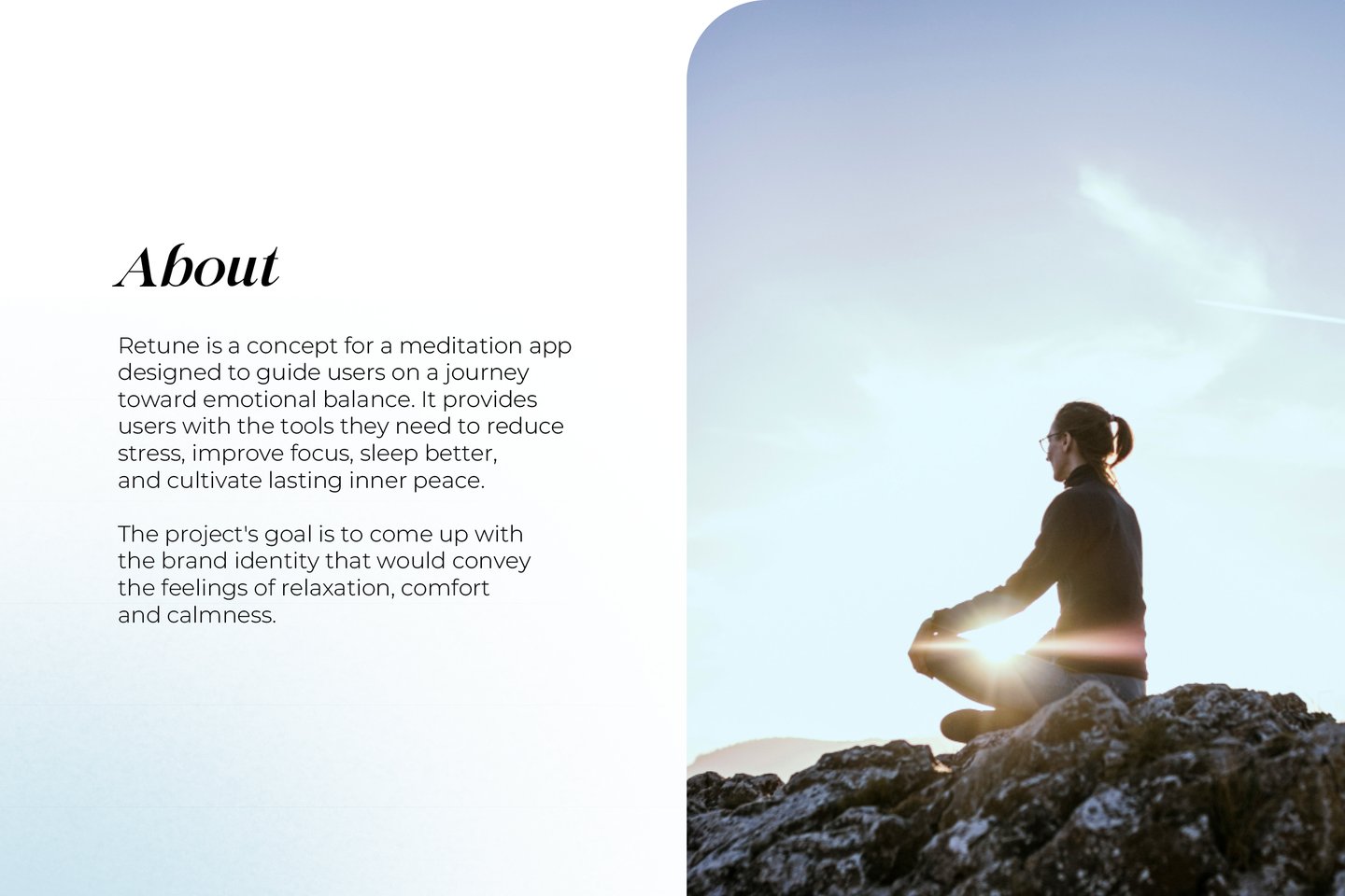
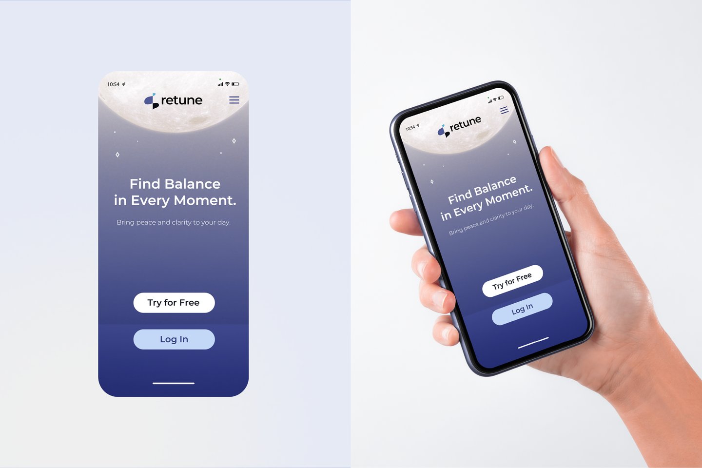
Retune is a concept for a meditation app designed to guide users on a journey toward emotional balance.
The project's goal is to come up with the brand identity that would convey the feelings of relaxation, comfort and calmness.


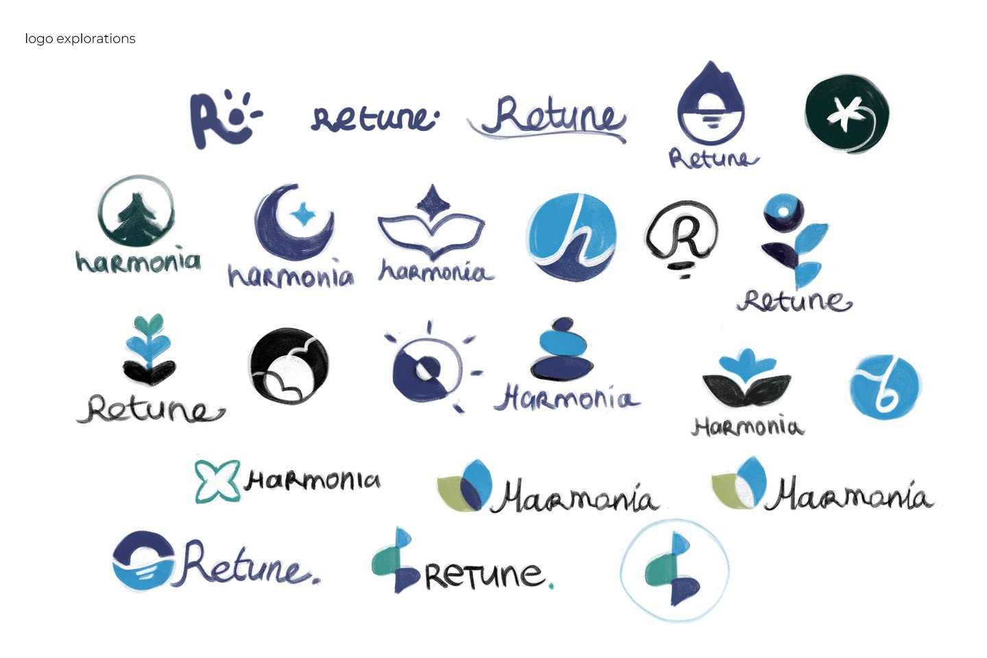





Originally, there were 2 potential names for the brand, Harmonia and Retune, and the logo explorations were completed based on them. I have set the objective to design a minimalistic and memorable logo that would convey peace and consist of soothing colours. Most concepts were designed to be associated with a calming sound or a natural object connected with rest, like vegetation or the moon.
The final logo for Retune was selected thanks to its fitting colour palette and graphics associated with harp and Treble Clef.
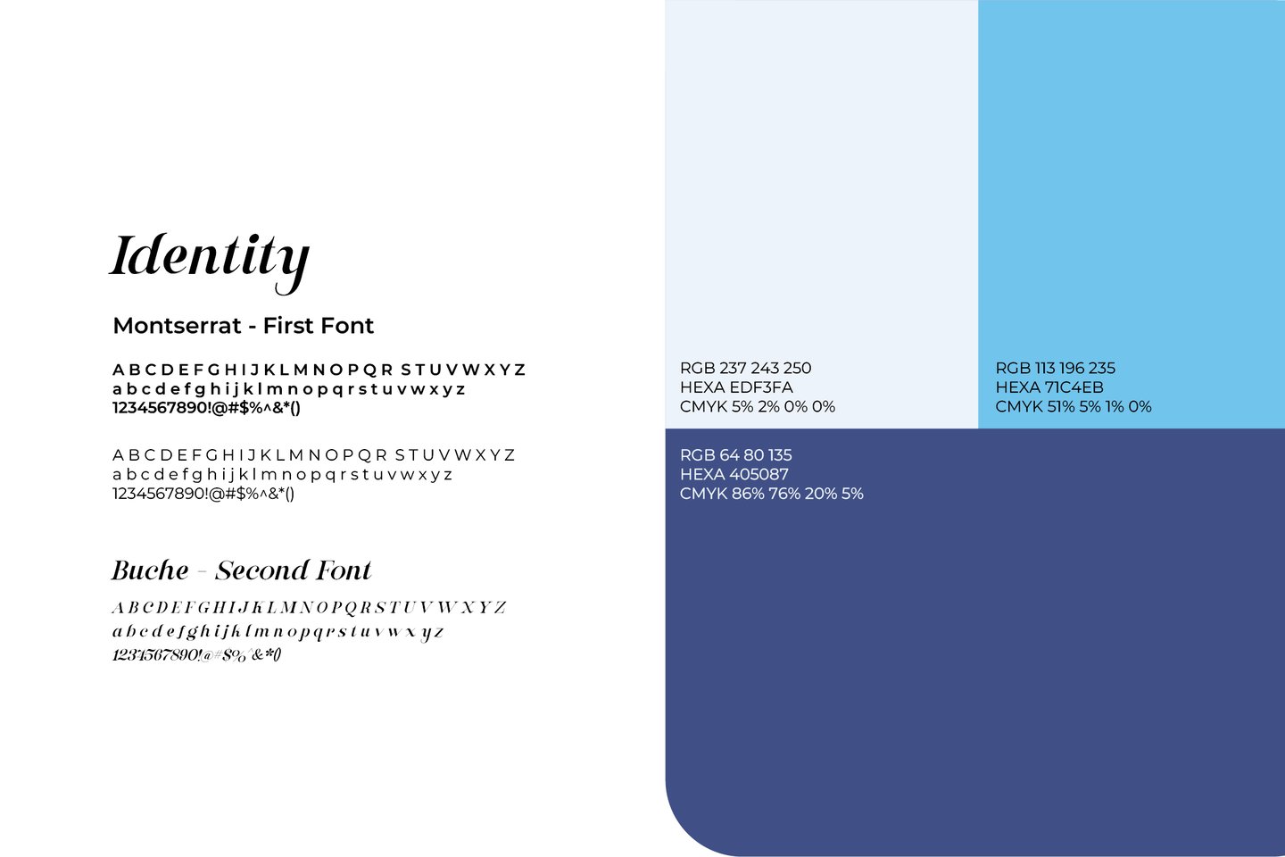
Montserrat and Buche typefaces were selected as they work in combination, being contrasting serif and sans-serif typefaces. The brand palette consists of analogous colours that work well on their own and with added accent colours.
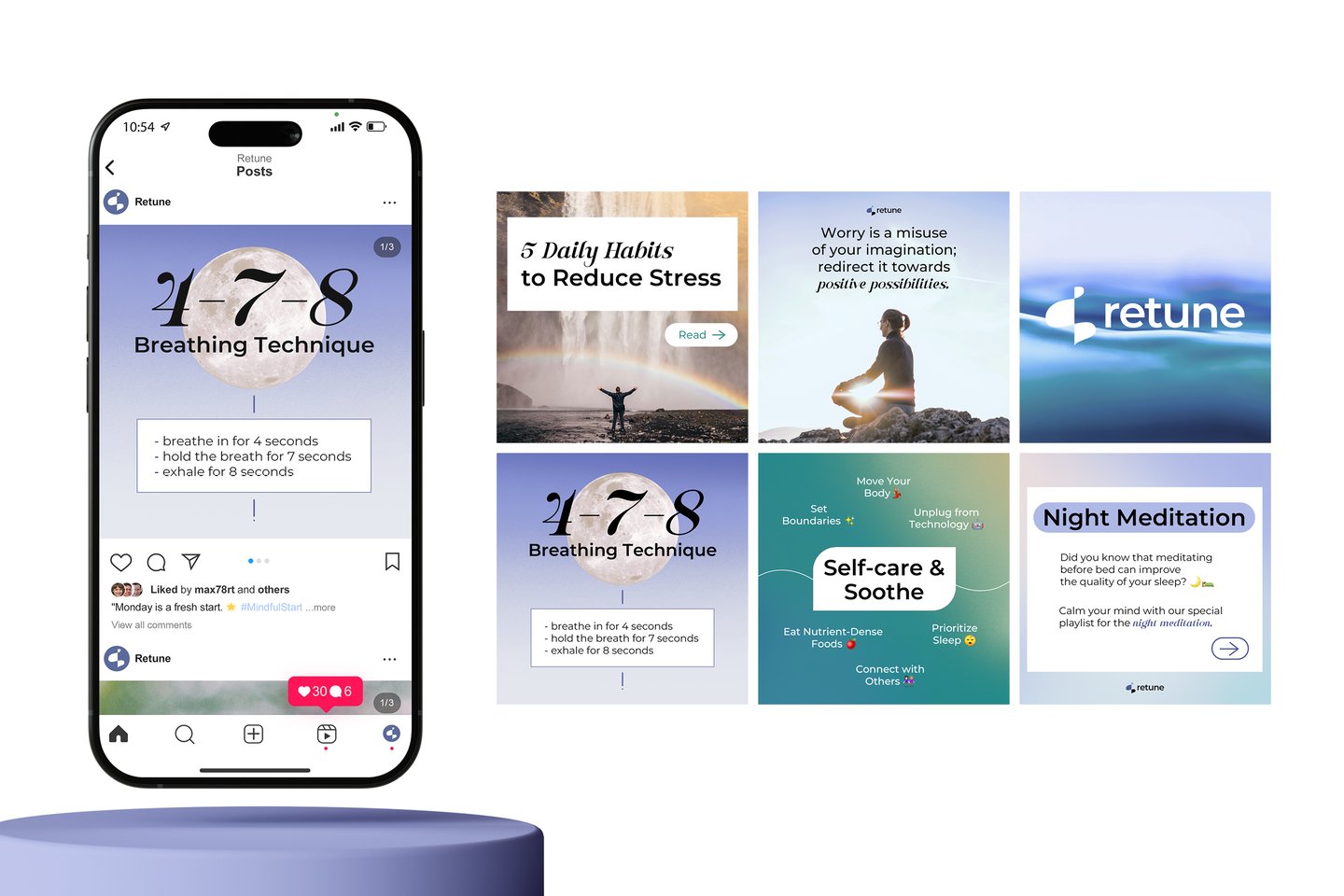
This set of Instagram posts is designed to assist the audience with meditation and stress-reducing tasks. The posts contain both useful tips and information related to the brand while also advertising Retune's services and plans for the app.
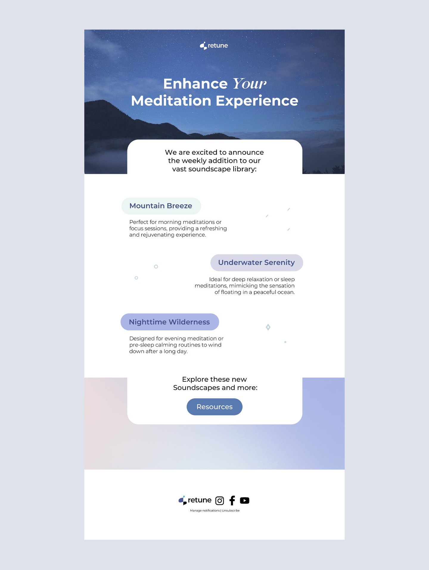
The digital marketing strategy for Retune also includes email marketing. It will include promotional emails, like new additions to the app's musical library, as well as a Newsletter, surveys and other types of emails.
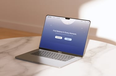
Retune could be accessed both with an app and on the web, giving users the ability to log in and conveniently use their accounts on any device.
