Move Force
Project type:
Brand Identity
Social Media Design
Stationery Design
Completed with:
Illustrator
Indesign
Photoshop
After Effects
Role:
Graphic Designer
Motion Graphics Animator
Overview:
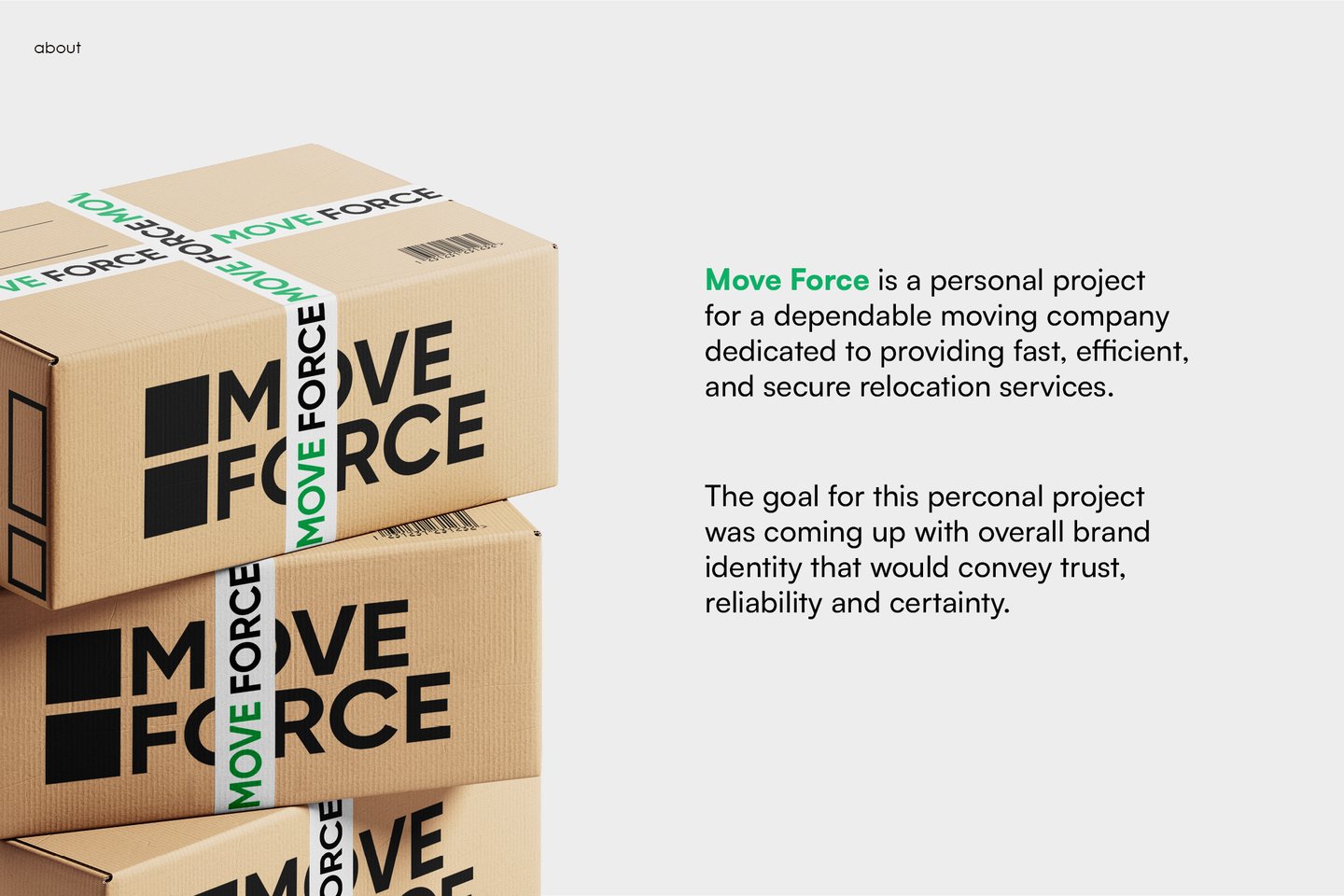
Move Force is a personal project for a dependable moving company dedicated to providing fast, efficient, and secure relocation services.


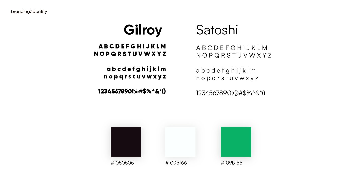






Gilroy and Satoshi were my choices for primary and secondary typefaces due to their high legibility and simple design.
This decision was made to convey that the company values simple and open communication with the client.
The choice of brand colours supports the idea of simplicity and straightforward approach of MoveForce, with green colour meaning change and renovation.
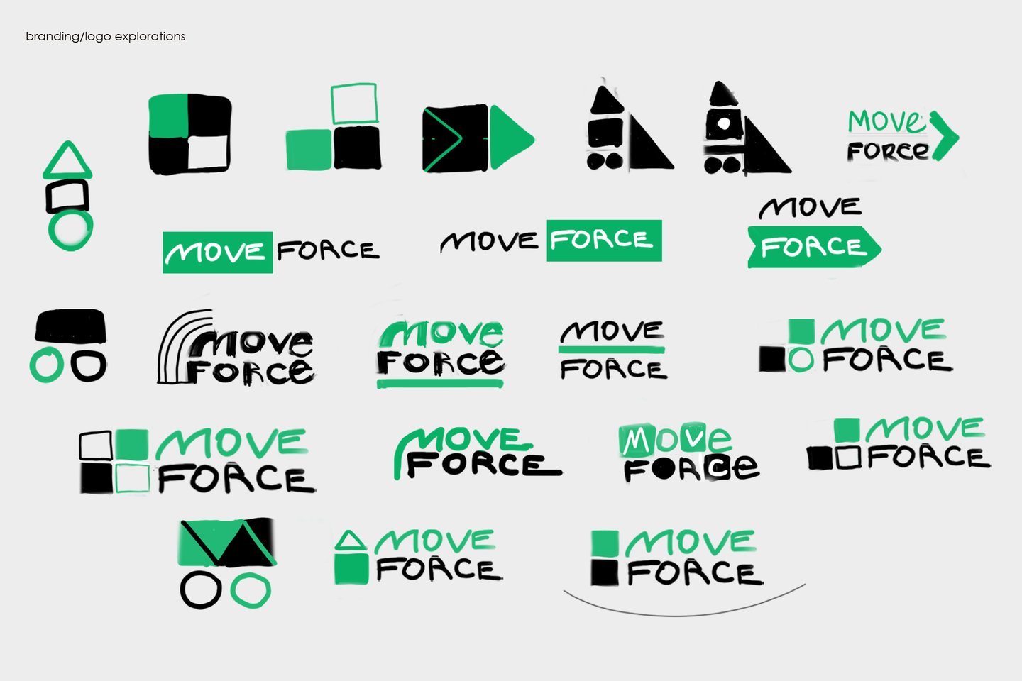
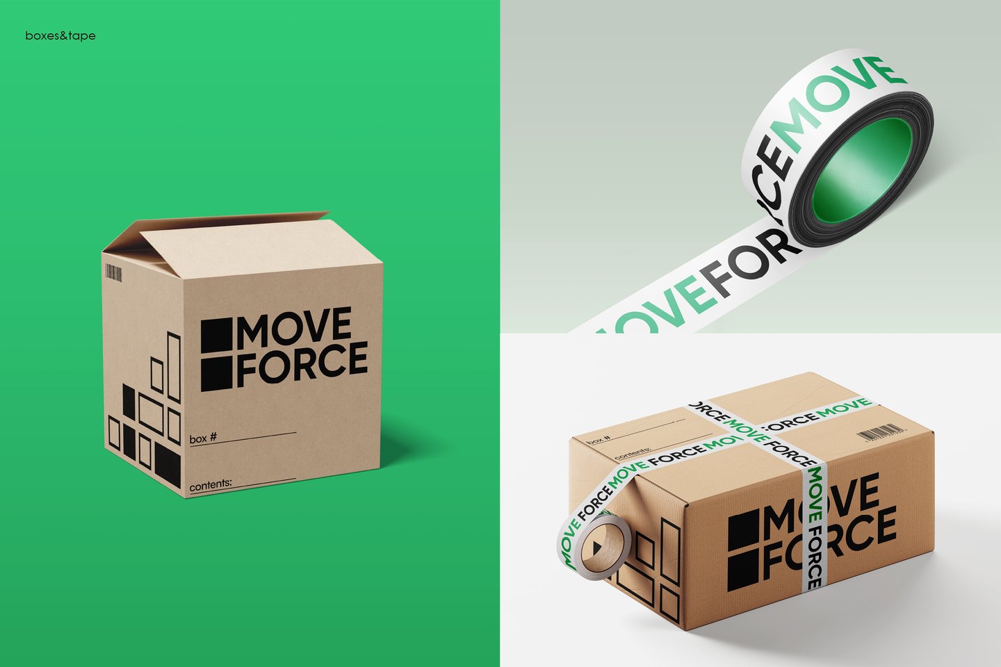
During logo exploration, I have experimented with text position and graphics for the logo. The main goal was to come up with a minimalistic and effective design that would be associated with the process of moving, a truck, house, or boxes.
For the final logo, I have decided on the combination mark in the lower right corner. The 2 cubes symbolizing moving boxes are aligned with the text horizontally by colour and vertically by shape, which creates balance and connection between elements.
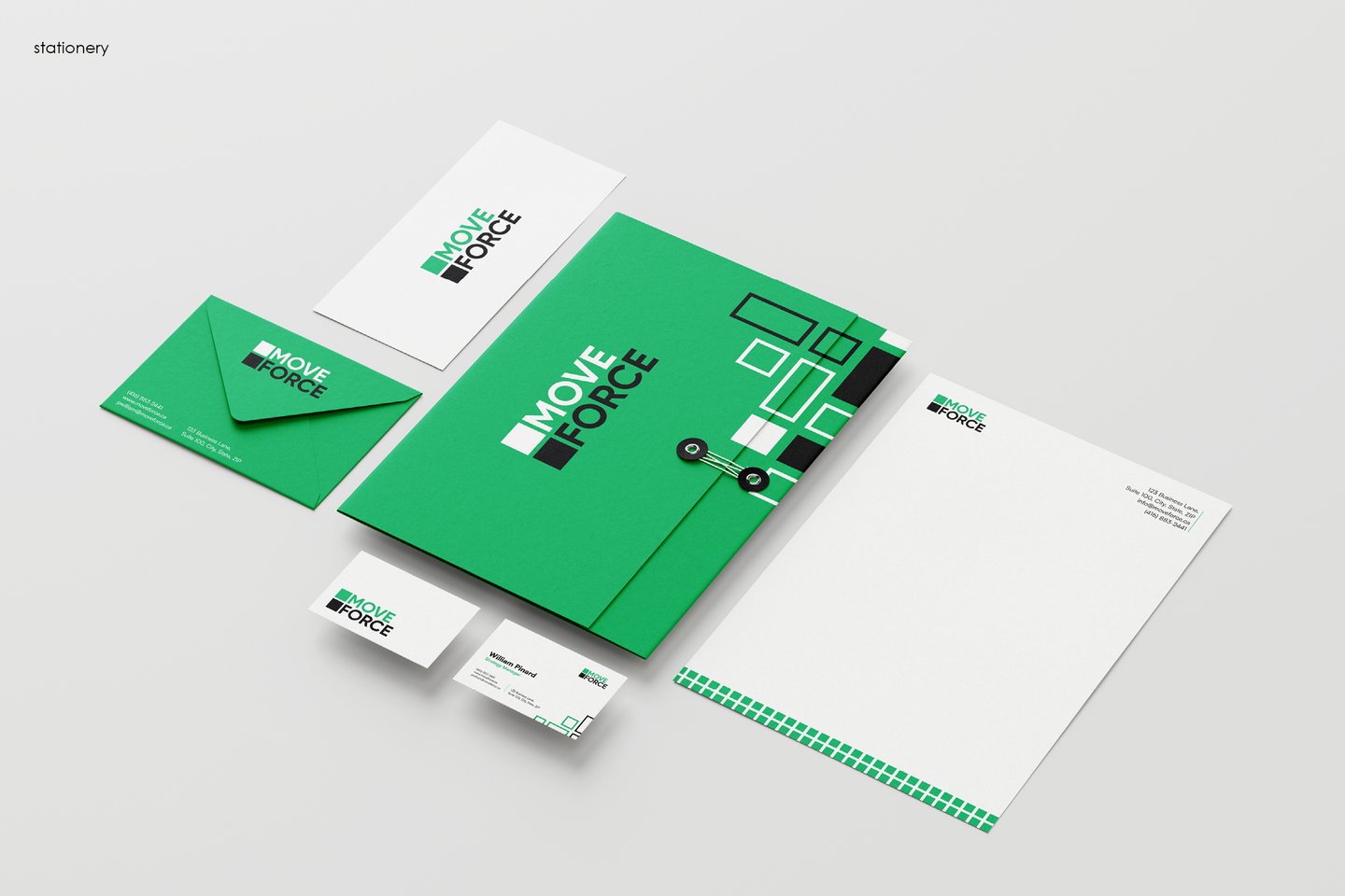
The following stationary setup showcases several company assets, including a custom envelope emloyee business card, letterhead and a file folder.
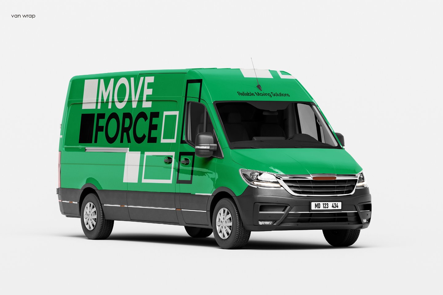
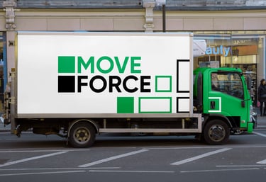
For the van wrap designs, I have come up with 2 options presented below. They were designed to follow the brand guidelines and include both the logo and brand graphics.
The set of Instagram posts displays the type of content that would be shared across the social media of Move Force. The posts are meant to build trust with the audience by sharing useful tips related to moving and information on the company's services and purpose.
